A basket of bright flowers--this says "summer"! These are the party favor boxes (pg 27, $5.95) in the summer mini catalog--which you can still order from until the end of this month.

They come with the "belly bands" in tempting turquoise and rose red--you just add a tag and a little embellishment. For these, I used the flower from Petal Pizzazz (pg 102, reg catalog, $32.95) and stamped it in pumpkin pie, tempting turquoise, and rose red. I cut them all out and then punched out the centers of a few. I either layered a cut out, punched out flower on top of a whole one, so you could see the center of the bottom flower showing through, or I layered the punched circle on top of a whole flower. Added old olive leaves from the two-step bird punch and "for you" from the Great Friend stamp set on an oval for the tag. I really use that little "for you" stamp often! I filled these with chocolates and a Bible verse and gave them to the people who are taking volunteer training at the
Sunrise Pregnancy Resource Center. I really need to post about the pregnancy center, but it will have to wait until another day! OK, on to another card....
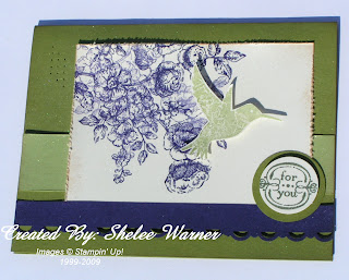
This card used the elements of style stamp set (pg 12, $27.95) I experimented with the new In Colors. The card base is old olive, and the lighter green strip is pear pizzazz, as is the hummingbird. I used concord crush for the punched border piece and the stamped flowers. I distressed the edges and added a little creamy caramel ink... I know, its gone but I haven't had a chance to check out our new distressing kit yet! I also spritzed it with some vanilla shimmer smooch spritz at the end. Sorry about the shadows around all the layers, etc... I took these pictures outside where the sun would give me nice bright light, but the wind came up and I had to lay it flat to take a photo. I need a new camera! Have a great rest of the week, everyone!
 They come with the "belly bands" in tempting turquoise and rose red--you just add a tag and a little embellishment. For these, I used the flower from Petal Pizzazz (pg 102, reg catalog, $32.95) and stamped it in pumpkin pie, tempting turquoise, and rose red. I cut them all out and then punched out the centers of a few. I either layered a cut out, punched out flower on top of a whole one, so you could see the center of the bottom flower showing through, or I layered the punched circle on top of a whole flower. Added old olive leaves from the two-step bird punch and "for you" from the Great Friend stamp set on an oval for the tag. I really use that little "for you" stamp often! I filled these with chocolates and a Bible verse and gave them to the people who are taking volunteer training at the Sunrise Pregnancy Resource Center. I really need to post about the pregnancy center, but it will have to wait until another day! OK, on to another card....
  This card used the elements of style stamp set (pg 12, $27.95) I experimented with the new In Colors. The card base is old olive, and the lighter green strip is pear pizzazz, as is the hummingbird. I used concord crush for the punched border piece and the stamped flowers. I distressed the edges and added a little creamy caramel ink... I know, its gone but I haven't had a chance to check out our new distressing kit yet! I also spritzed it with some vanilla shimmer smooch spritz at the end. Sorry about the shadows around all the layers, etc... I took these pictures outside where the sun would give me nice bright light, but the wind came up and I had to lay it flat to take a photo. I need a new camera! Have a great rest of the week, everyone!


